
In the previous sections we were looking at single stock and time and asking “Can yesterday predict today?”. Which is realm of Machine #1, which we try to get and , asset structure is about optimisation, Machine #2.
In asset structure, we basically stop considering the assets one by one independently and model them jointly. This is the definition of Vanilla Markowitz that we talked about earlier. We cannot look assets and in a vacuum, they interact with different assets as well.
To jointly model the assets, we need to find correlation, which is represented by . Correlation is a score from -1 to +1 that tells us how stocks move together.
Let’s say we split our money 50/50 between two stocks:
- Scenario Fully Correlated
- Example: Buying Coke and Pepsi.
- The portfolio does not benefit from diversity. If sugar industry crashes, then both stocks will crash. Nothing accomplished by splitting the money.
- Scenario : Uncorrelated
- Example: Buying Apple and Wheat Farm
- The variance is reduced the half. İphones and Wheat have nothing to do with each other. By mixing two random things, we cut our risk in half without losing expected return.
- Scenario : Negatively Correlated
- Example: Buying an Oil Company and an Airline
- The diversity benefit increases massively. When one loses money, the other one mathematically must make money.
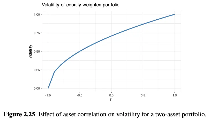
In reality, assets tend to have high correlation close to 1 and finding uncorrelated assets is the holy grail. But why? Because of the Stylized Facts we learned earlier. When a panic happens, all stocks, bonds and crypto suddenly correlate to 1. Everyone sells everything.
So how do quants survive? The only way to get perfect is to use “synthetic asset created for the sole purpose of hedging”. This means quants don’t just buy stocks, they use derivatives (like put options or short selling). They intentionally buy a mathematical contract that is guaranteed to explode in value only if the S&P 500 crashes. By mixing the S&P 500 with this “synthetic” insurance policy, they force their portfolio’s correlation down, locking in the ultimate Markowitz risk-reduction.
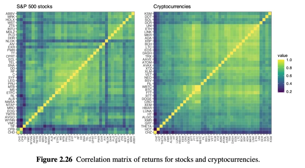
This heatmap is basically , the covariance matrix. It compares every stock against every stock. As expected the diagonal line is fully yellow () because we compare stocks with themselves. There are almost no purple grid (low correlation), as we speak earlier.
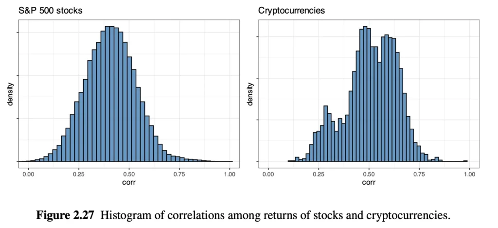
We can show the same heatmap in histogram as well. The bars almost completely non-existent at 0.0. The hump is still around 0.4. It means that if we pick two random stocks in S&P 500, there is massive probability that they move in sync with each other %40 of the time.
So, the question is, if every stock is a separate company with its own CEO, its own products, and its own earnings… why are they all moving together?
To answer this, we have two new concepts, Eigenvalues and Factor Model Structure. Eigenvalue is a scary word, but in finance it just means “Hidden underlying force”. Basically our question is “What hidden forces are causing all these stocks to turn green on the heatmap?”
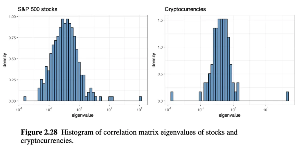
- Look at the S&P 500 chart on the bottom left. Most of the blue bars are clumped together on the left side of the chart. These are tiny, weak “hidden forces.”
- But look at the far right. There is a single, isolated blue square way out at the 10^2 mark, Because this chart is on a logarithmic scale, that single square is exponentially more powerful than all the other bars combined.
- A single eigenvalue is totally predominant (corresponding to the market index).
Stocks do not move based on their own fundamental data. They move because there is one giant, hidden magnet pulling all of them at exactly the same time: The General Market.
- If the Federal Reserve raises interest rates, it acts like a giant magnet pulling the entire stock market down. It doesn’t matter if Apple had a great quarter; the magnet pulls Apple down with it.
- That single “Eigenvalue” on the right side of the chart is mathematical proof of the Giant Magnet.
So what is eigenvalue anyway? Most of us probably saw it at linear algebra class in university years, so i won’t bore you with mathematics. Imagine you draw an arrow on a stretchy rubber sheet. When you stretch the sheet from certain way, an arrow don’t change direction it just get longer or shorter.
- The rubber sheet is the Correlation Matrix.
- An arrow is Eigenvector.
- The amount of arrow stretched is the Eigenvalue.
In the book, the “rubber sheet” is the massive, messy Correlation Matrix (that colorful heatmap of 500 different stocks). If you look at 500 stocks bouncing around every day, it looks like pure chaos. But the computer uses linear algebra to find the “Eigenvectors” and “Eigenvalues” to see what is actually stretching the market.
- The Eigenvector (The Theme): The math discovers hidden “themes” or “forces” pulling the stocks. For example, it might find one vector that pulls all Tech stocks up, and another vector that pulls all Oil stocks down.
- The Eigenvalue (The Power Level): This is the crucial number. The Eigenvalue tells the computer how much of the market’s total chaos is caused by that specific theme.
Consider the Figure 2.28. The computer looked at the S&P 500 and said “I found 500 different Eigenvectors (themes) pulling on this rubber sheet. Let’s look at their Eigenvalues (power levels).“
- The Tiny Bars (Low Eigenvalues): The computer says, “I found a theme where Apple went up because they sold a lot of iPhones. But it has a tiny Eigenvalue. It only affected Apple. The rest of the market didn’t care.”
- The Giant Bar on the Right (Massive Eigenvalue): The computer says, “I found one massive theme. When this theme pulls, all 500 stocks stretch in the exact same direction at exact same time. It is so powerful that it accounts for almost half of all the movement in the entire stock market.”
That giant Eigenvalue is the mathematical proof of the “General Market Trend”
This process is called Principal Component Analysis (PCA). If a quant wants to analyze the stock market, they don’t want to build a model that tracks 500 individual stocks. Instead, they use linear algebra to extract the Eigenvalues. The computer tells them, “Ignore 495 of these stocks. Just track these top 5 Eigenvectors, because their massive Eigenvalues prove they control 90% of the entire stock market.”
Vanilla Markowitz math assumes that we can diversify our risk by buying 50 different stocks, but it is not possible.
Resources
Portfolio Optimisation: Theory and Application by Daniel P. Palomar, Page 33 to 36.