Vanilla Markowitz assumes that the stock market behaves like a perfect bell curve, which also known as Gaussian (Normal) Distribution:
 f(x)=\frac{1}{\sigma\sqrt{2\pi}}
\exp\left(-\frac{(x-\mu)^2}{2\sigma^2}\right) - Where is mean (center) and is variance (wideness).
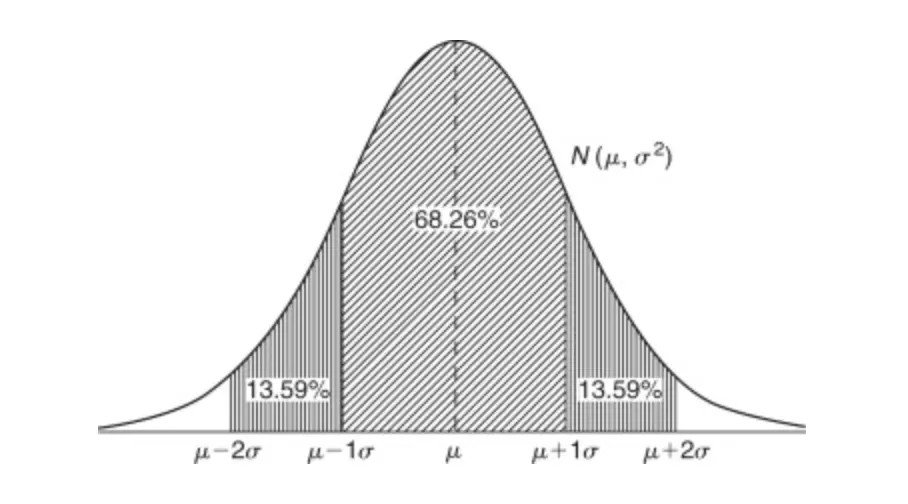
Gaussian Distribution is very useful for explaining physical concepts like human height or thermal noise, because physical world have limitations. Whereas finance world involved with human emotions, that’s where everything mixes up.
If we use Normal Distribution in finance, it tells us that massive market crashes happens in every 100.000 years, but actually they happen in almost every decade.
So since Gaussian Distribution is broken for finance, engineers upgraded the formula by adding Skewness and Kurtosis.
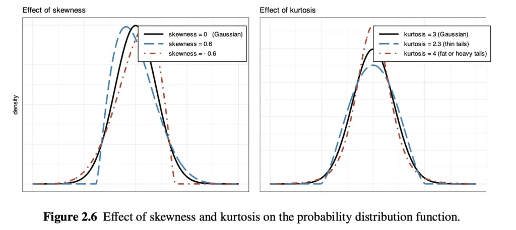
Before begin to explain, let’s clarify what is probability density function is. Its X-axis shows the return, the percentage change. Left side shows negative returns and right side shows positive returns. Y-axis represent its probability to happen.
Skewness: Skewness measures asymmetry, means that if the hump leaning to one side. We know that Bell Curve is perfectly mirrored, but also it does not represent actual markets. So there has to be asymmetry.
On the left graph, black line is perfect Gaussian, red line shows negative skewness, blue line shows positive skewness (both of them shows what actual market looks like). These skewness graphs literally tells us that most days we make tiny bit of money, like +%0.5-%1, the hump is on positive side. But when crash happens, it crashes violently.
Kurtosis: Kurtosis measures fat tails, extreme events. It measures how thick the edges of the graph are.
On the right graph, black line is Gaussian again. Red and blue dashed lines show kurtosis. For example when we look at the red kurtosis line, it simply decay faster but before going to zero, it leave more room than black line, says that probability of crashes are more likely than normal distribution.
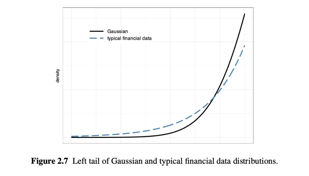
“Financial data typically exhibits negative skewness and large kurtosis” but why? Investors slowly buy stocks over time but when bad things hit, everyone panics and sell on the same day. That’s the reason of negative skewness. The reason of large kurtosis are explainable with herd mentality or dominon effect. When some stock goes down %2, some trading algorithms might sell it, it triggers stock to goes far more down and it triggers even more people or program to sell.
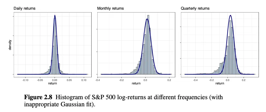
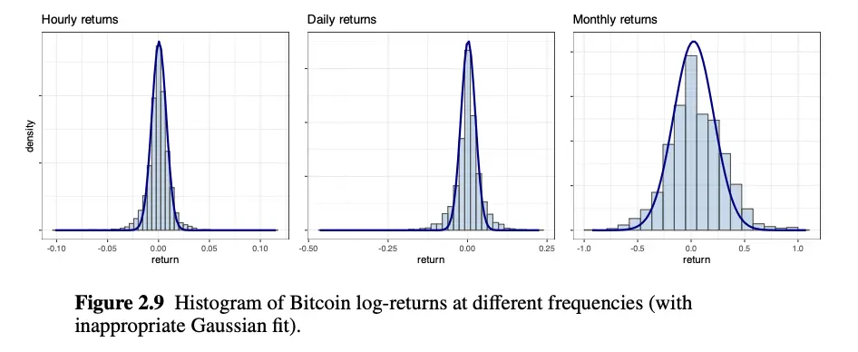
Figure 2.8 and 2.9 shows histograms of the S&P 500 and Bitcoin at different frequencies. It can be seen that histograms are significantly heavier than the Gaussian and histograms are not symmetric (Bitcoin’s asymmetry is a bit less).
Asymmetry and Skewness
Zero skewness implies symmetric distribution, negative skew implies thick tail is on left, positive skew implies thick tail is on the right.
\text{Skewness: } \mathbb{E}\left[\left((X - \mu)/\sigma\right)^3\right]. - : The actual return on a specific day (e.g., -5%).
- : The average return (e.g., +0.1%).
- : Asks: “How far away from normal was today?”
- : We divide by the standard deviation. This just standardizes the math so we can fairly compare a wild asset (Bitcoin) to a calm asset (Apple).
- : Why cube? If we square the number, negative ones become positive. Also it is good because it magnifies the effect of extremes.
- : Expected value, take the average. The computer runs this cubed calculation for every single day in history, and then averages them all together.
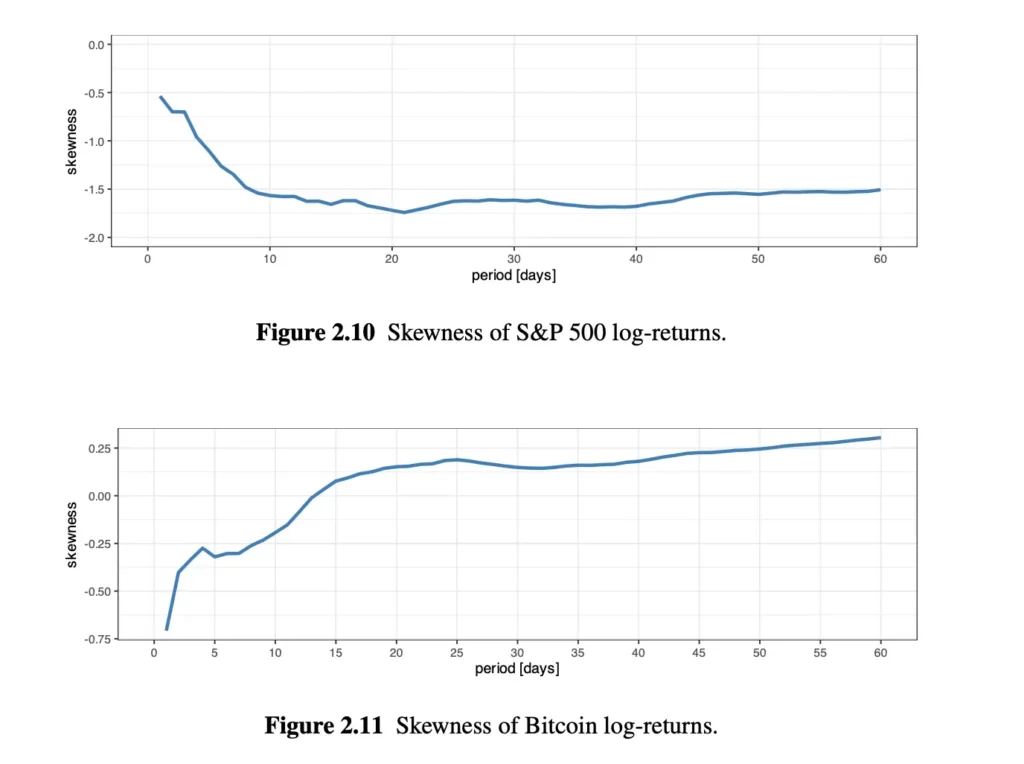
First, let’s understand the axes:
- X-Axis: The Skewness Score. Below 0 means negative skew (crashes are worse than rallies). Above 0 means positive skew (rallies are more explosive than crashes). 0 means perfectly symmetrical.
- Y-Axis: This is not a timeline of 2007 to 2022. This represents the length of the investment. Day 1 means “Calculate the skewness if I only hold the asset for 1 day at a time.”, day 30 means “Calculate the skewness if I hold the asset for 30 days at a time.”
S&P500 graph:
- Look at the left side (Day 1). The skewness is around -0.5. This proves the “stairs up, elevator down” rule. Daily crashes are worse than daily gains.
- Now follow the blue line to the right. As you hold stocks for longer periods (10 days, 20 days), the line dives down to -1.5 and stays there.
- The Meaning: The stock market gets more negatively skewed the longer you hold it. A bad month in the stock market is structurally much more violent than a good month.
Bitcoin graph:
- Look at the left side (Day 1). Bitcoin is also negatively skewed around -0.7. Daily crypto crashes are brutal.
- But follow the line to the right! As you calculate returns over 15 days, 30 days, or 60 days, the line climbs up, crosses the 0.00 line, and actually becomes slightly positive (+0.25).
- The Meaning: Over a multi-week timeframe, Bitcoin actually becomes symmetrical (or slightly positively skewed).
Cryptocurrencies seem to be more symmetric than stocks. Because stock market has a ceiling, but has no floor. Companies have actual business models. But crypto is pure speculation, have no earning models, driven by hypes.
What these information tells us practically? Skewness is about the shape of the ride, not the destination. Skewness tells us how it feels to hold the investment while it makes or loses the money. When an asset have negative skewness, it means we will experience long, boring periods of winning interrupted by sudden moments of losing. It tells that if you bought the stock and it crashed after 3 days, you shouldn’t panic. Positive skewness is exact opposite of negative skewness, it says that you will experience long periods of nothing or bleed money slowly interrupted by sudden and massive gains. If you buy Bitcoin, you should know that profit will likely come in massive, sudden bursts.
“I love the S&P 500 because it prints steady money, but I am terrified of its negative skew (the sudden crashes). I know Bitcoin is wild, but over a 60-day period, it has a positive skew (explosive upside potential).
Therefore, I will put 90% of my money in the S&P 500, and 10% in Bitcoin. When the S&P 500 eventually takes the ‘elevator down’ and crashes, the explosive positive skew of Bitcoin might fire off at the same time, acting like a parachute to save my portfolio.”
Heavy Tailness and Kurtosis
We have a plot type called Q-Q (quantile-quantile), which allows for clearer assessment of the degree of heavy tails as compared to previous plots.
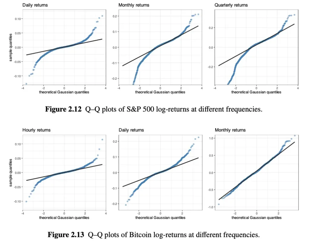
Again, black line represents Gaussian and blue dots represents real market data. How to read these graphs?
- Look at the middle of the line: The blue dots hug the black line perfectly. This means for normal, boring days, where Bell Curve works fine.
- Look at the left edges. Blue dots dive below the black line. For example black line says “we dropped %2”, but blue dots says “actually we dropped %4”.
- Look at the right edges, blue dots shoot above the black line.
Also notice this, as we reduce the frequency, blue dots and black line getting closer, it proves the stylized fact, which says that “If you zoom way out to monthly data, the market starts to behave more normally)”.
So how does computer measure those fat tails?
\text{Kurtosis: } \mathbb{E}\left[\left((X - \mu)/\sigma\right)^4\right]. Same formula as skewness, expect this is power of 4. Why? Two reasons. First, any number taken to an even power (2, 4, 6) becomes positive. Kurtosis doesn’t care if it was a massive crash or a massive rally; it only cares about how extreme it was. Second, the power of 4 acts as a massive magnifying glass. A tiny normal day () stays small (1), but a 5 sigma black swan crash () explodes into a giant penalty score (625).
Excess Kurtosis: By a weird quirk of mathematics, a perfect, normal Bell Curve has a raw Kurtosis score of 3. Because quants like to benchmark things to zero, they just subtract 3 from the final score.
\text{Excess Kurtosis = Raw Kurtosis - 3} - If the score is 0, it’s a perfect Bell Curve.
- If the score is above 0, it has fat tails.
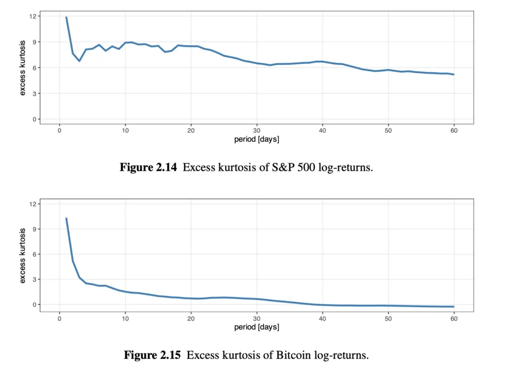
- S&P 500: Even if we hold the S&P 500 for 60 days, the line stays way above zero. The S&P 500 always has fat tails. Crash risk is permanently embedded in the stock market, no matter how long you hold it.
- Bitcoin: Look at how fast the Bitcoin line drops; By the time you reach 40 to 60 days, the Excess Kurtosis hits 0.
Mathematically speaking, if we hold Bitcoin for 60 days, it behaves exactly like a perfect, safe, predictable Bell Curve. Over a 2-month period, Bitcoin appears to be mathematically safer and more predictable than the S&P 500. If we feed this conclusion into Markowitz Optimizer, computer will tell to put all our money into Bitcoin. But we need to look closer by looking at the excess kurtosis during different periods:
- In normal years (2017-2019, 2021-2022), Bitcoin’s Kurtosis is very low (around 2 or 3).
- BUT IN 2020 (The COVID Crash): The S&P 500 kurtosis jumped to 8.51. Bitcoin’s kurtosis exploded to 50.87.
Data modeling (Machine #1) is incredibly dangerous if you don’t use human common sense. If you average out 5 years of Bitcoin data, the math tells you it is a perfectly safe Bell Curve. But the reality is that during a true, global panic (like 2020), Bitcoin will fail spectacularly and suffer Black Swan crashes vastly worse than the stock market. A good quant builds a portfolio that can survive 2020, not just the averages of the good years.
Suit Fitting
So, we clearly know that we can’t use standart bell curve for Machine #1, what mathematical curve are we supposed to use? There are several math equations that can be used, and computer uses a grading system called Anderson-Darling test. It have some math behind it but we will consider its final score, called p-value.
- The Rule: The passing grade is 0.05.
- If p-value is LESS than 0.05 (Fail): The computer says, “I reject this model. The math does not fit the real-world data at all.”
- If p-value is GREATER than 0.05 (Pass): The computer says, “I accept this model. This math is a great fit for reality.”
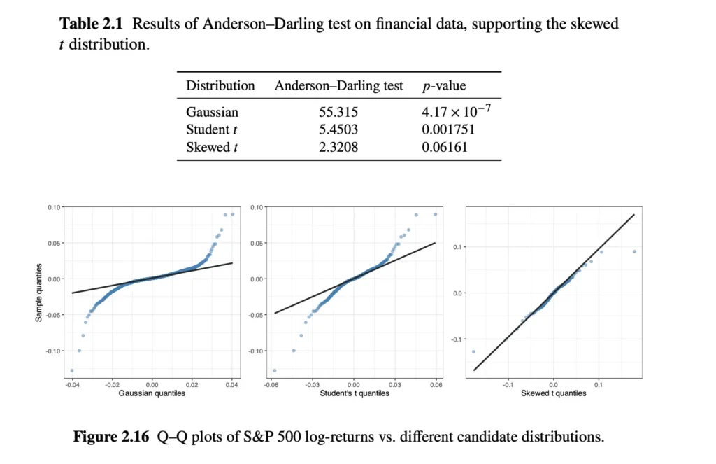
For example, we tested 3 models and only “Skewed t” model pass the threshold. We can clearly see that market data almost perfectly fits with that model.
Typical thresholds for determining whether a 𝑝-value is small enough are in the range 0.01–0.05.
Resources
- Portfolio Optimisation: Theory and Application by Daniel P. Palomar, Page 24 to 29.
- https://www.sciencedirect.com/topics/biochemistry-genetics-and-molecular-biology/gaussian-distribution